Genealogy Services, Old Photos, Postcards, Trade Cards, Etc.

Le Lièvre Et La Tortue

Le Lievre Et La Tortue pc1Le Lievre Et La Tortue pc2

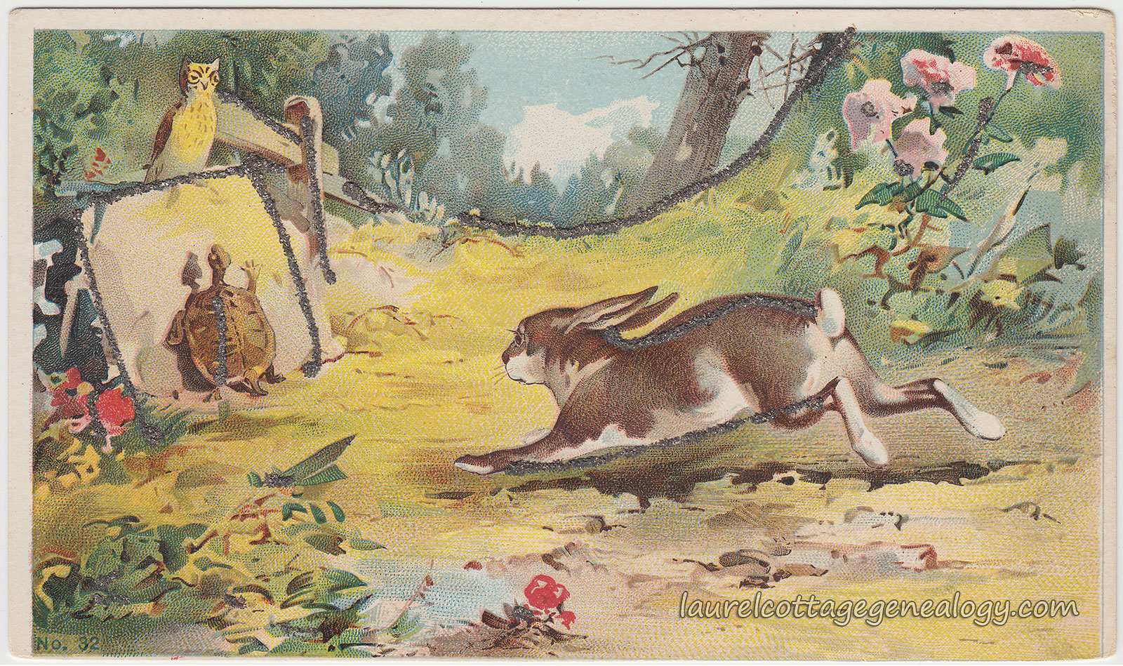
The Hare and the Tortoise…more commonly known in the U.S. as The Tortoise and the Hare….

This is an antique postcard produced from a work by an unknown artist. It appears to have been modeled after an illustration of Le Lièvre et la Tortue, that was printed in France, which in turn may have been taken from the work of French artist Gustav Doré rather than being by him. Check out the set of trade cards for Solution Pautauberge (a product which was in it’s day said to be a cure for rheumatism and bronchitis and a prevention for tuberculosis.) The set is entitled Fables de LaFontaine, (and you’ll notice the indication showing “d’apres Gustav Doré”  which might mean “modeled after” in this context.)

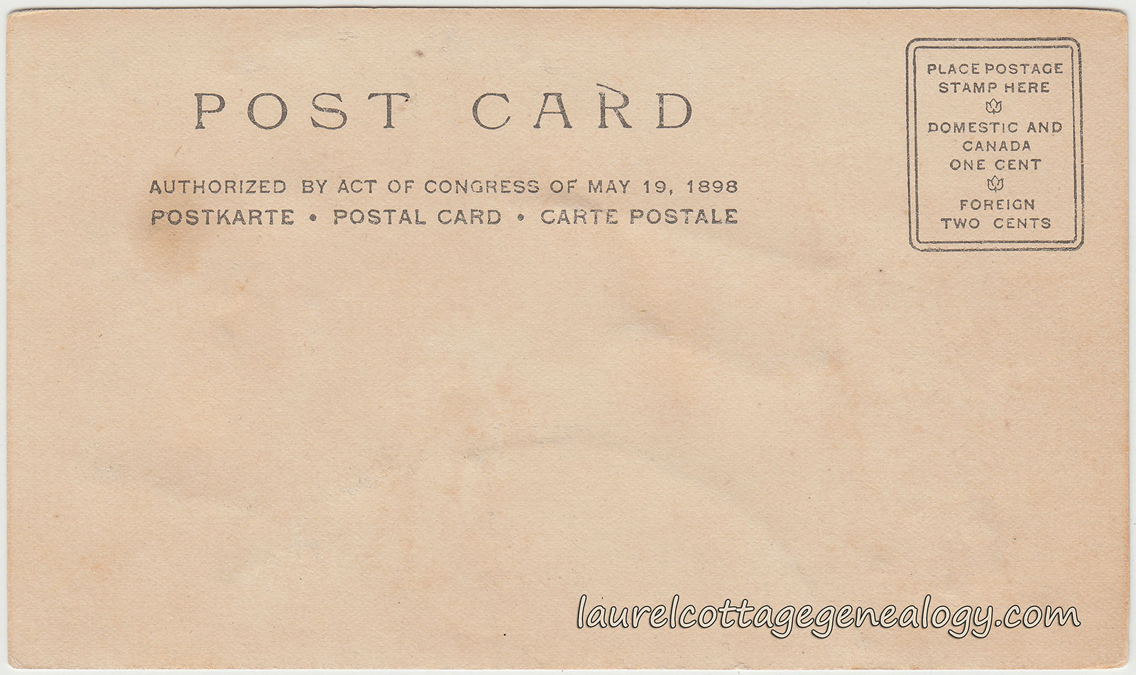
The back of the postcard indicates “Authorized By Act of Congress of May 19, 1898″ so this is a Private Mailing Card or PMC. The short PMC era ran from May 19, 1898 to December 24, 1901 when the new postal regulations ushered in the Undivided Back era. The size is smaller than what we consider the standard for postcards and measures about 5″ x 3”.

This beautifully done postcard is in very good shape for it’s approximate 115 year age, and includes glued on glitter highlights. In particular, the expression on the poor bun’s face is priceless, that panicked  “Oh, no!”  feeling, and note the beautiful, and correctly done, long bunny eyelashes!

Private Mailing Card. Circa 1898 – 1901. Unused. Publisher unknown, number 32.

Price:  $20.00   Size:  About 5 x 3″

Sources:  The Tortoise and the Hare. n.d. http://en.wikipedia.org/wiki/The_Tortoise_and_the_Hare. (accessed February 26, 2015).

Gustave Doré. n.d. http://en.wikipedia.org/wiki/Gustave_Dor%C3%A9. (accessed February 26, 2015).

“Solution Pautauberge.” Creighton University. Web accessed February 28, 2015.
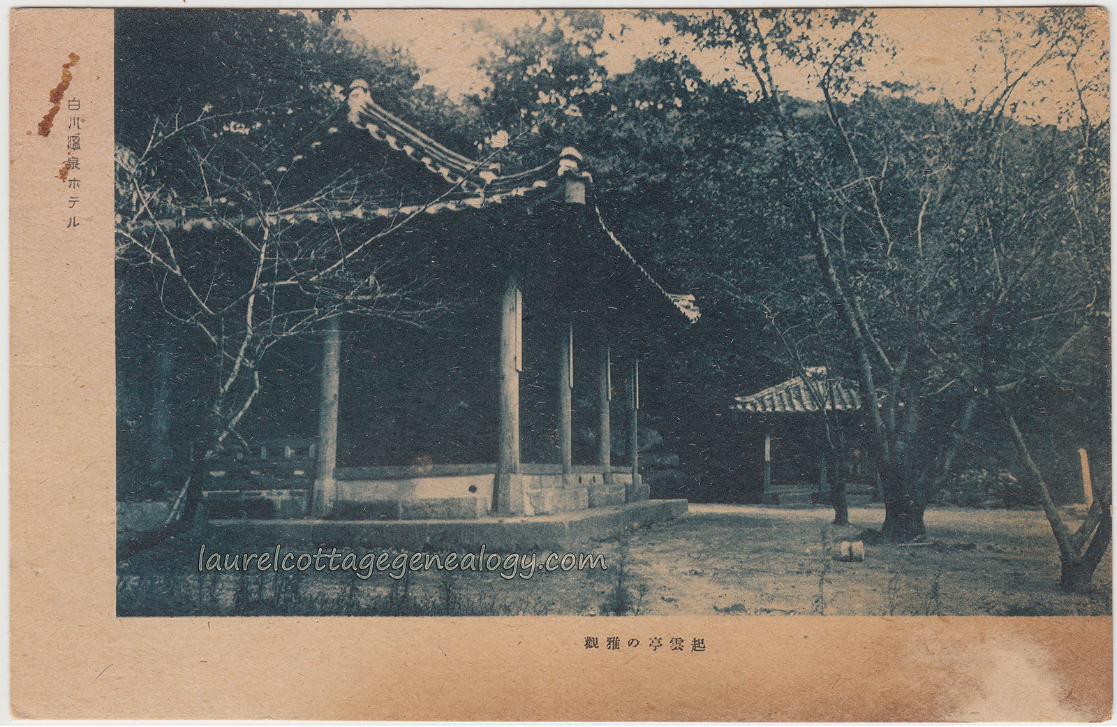
Hotel Grounds, Korea

Hotel Grounds Seoul pc1Hotel Grounds Seoul pc2

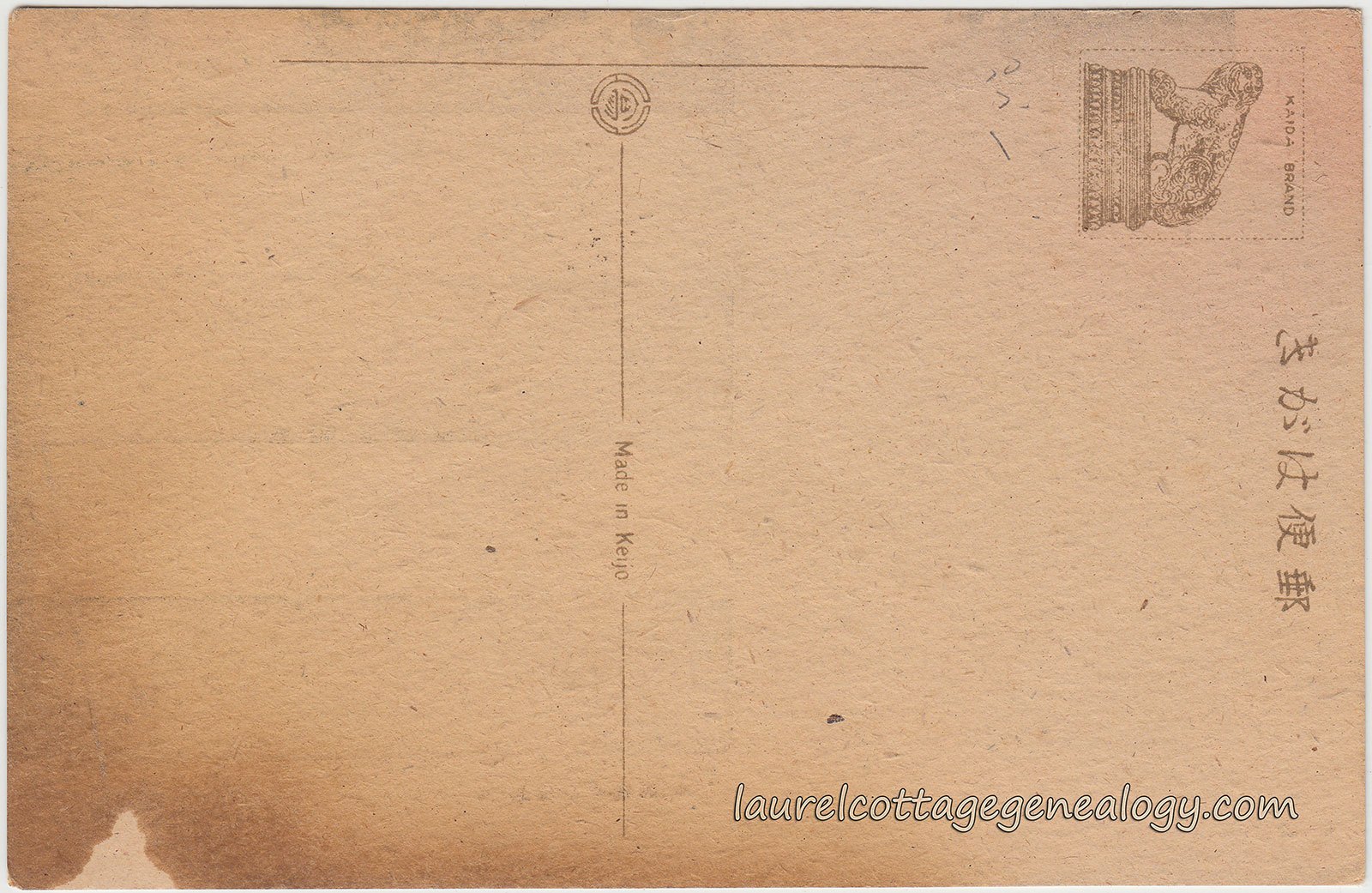
It was just by happy chance that this postcard was put up after the prior one (also regarding Seoul.) So, we’ve got a short theme going here. This one is from sometime between 1910 and 1945 when Japan occupied Korea. But arrgg (!) translation is difficult. The language is Japanese. From the front side, top left:  the first character, if taken by itself, translates as “white;” the second character, if taken by itself, translates as “river.” I’m not sure what the next two represent but the last three characters translate as “hotel.” It’s seems likely then that this photo was taken on the grounds of a hotel, possibly in what is now Seoul, South Korea, but the exact location will be unknown until we get a professional translation. But we know the time frame because of the printing in the divided line on the back which says  “Made in Keijo.”  Keijo was the Japanese name used for the city of Seoul during the colonial time period. The city had prior names, as well as Chinese names.

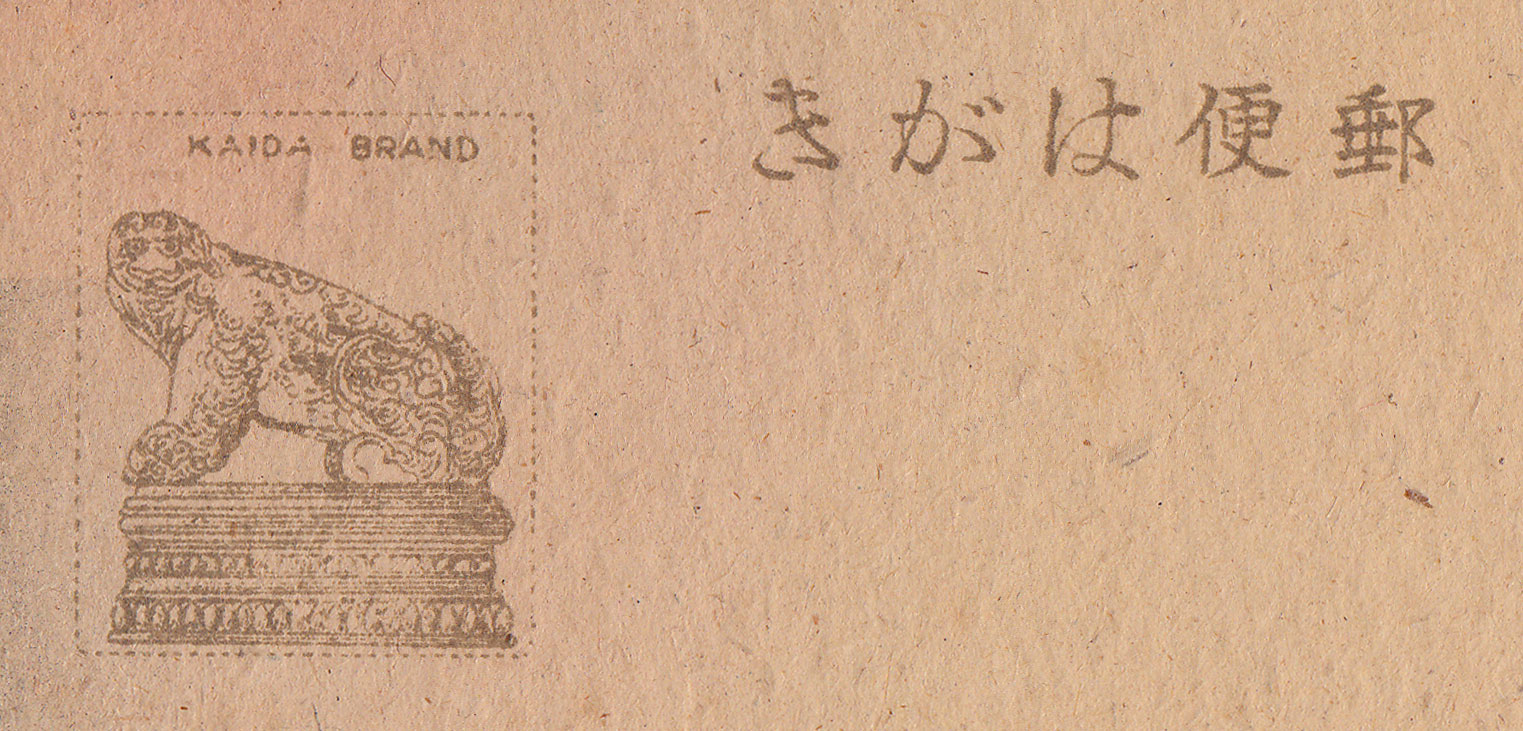
The stamp box is very interesting and shows a mythical figure from Korean and Chinese culture called a haechi or haetae or xiezhi (in China) and the words  “Kaida Brand.”
We’ll find out more about the postcard publisher when we get a proper translation. But the figure in the stamp box is described as a lion or dog-like beast with a small horn on it’s forehead (but not always seen with the horn) and a bell in or around it’s neck. This wonderful creature has many attributes, among them the ability to see everything, judge between good and evil, move backward and forward through time, and protect against disaster. It is often seen in Korean architecture, and since 2009 has been the official mascot of Seoul. And in the Republic of China can be seen on the badges of the military policemen, and is engraved on the gavels of the law courts of the People’s Republic of China.

Kaida Brand Stamp Box

Last but not least, this postcard seems to be a pretty rare find; no others have been found online, as of the date of this post.

Divided back, unused postcard. Made in Keijo (present-day Seoul, South Korea.) Stamp box shows “Kaida Brand.”

Price:  $35.00

Sources:  Names of Seoul. n.d. http://en.wikipedia.org/wiki/Names_of_Seoul. (Accessed February 22, 2015).

Haetae. Mythical Creatures Guide. http://www.mythicalcreaturesguide.com/page/Haetae. (Accessed February 23, 2015).

Xiezhi. n.d. http://en.wikipedia.org/wiki/Xiezhi. (Accessed February 23, 2015).

Seoul Anglican Cathedral

Seoul Anglican Cathedral pc1Seoul Anglican Cathedral pc2

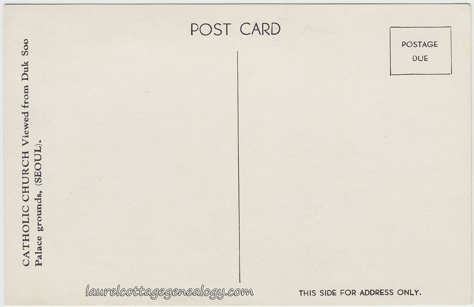
This postcard, from about the 1950s or 1960s, was found in the tourist postcard envelope of the prior post (but it would certainly seem unlikely that this one was part of that original set, since that cover references Japan.) The description on the back here is:   “CATHOLIC CHURCH Viewed from Duk Soo Palace grounds, (SEOUL).”

This church, located at 3 Jeong-dong, Jung-gu in Seoul, South Korea, is the Cathedral Church of St. Mary the Virgin and St. Nicholas, but is also known as Seoul Anglican Cathedral or just Seoul Cathedral. It was built in the Romanesque Revival architectural style, and opened in 1926. Among other things, the church’s construction history is very interesting and has a quite unique aspect about it. It was actually completed in 1996, due to some major help from a British tourist, who after visiting the church in 1993, went back to England and located the original blueprint of the church at the museum where he worked! The original design, by British architect, Arthur Dixon, was to construct the church in the shape of a cross, but this didn’t happen due to financial problems. So, it wasn’t until about seventy years later that Dixon’s vision finally became a reality.

Divided back, unused postcard. Circa 1950s – 1960s.

Price:  $5.00

Source:  Seoul Anglican Cathedral. Visit Seoul.  Web accessed February 21, 2015.

Custom Of Japan

Custom Of Japan 1Custom Of Japan 2

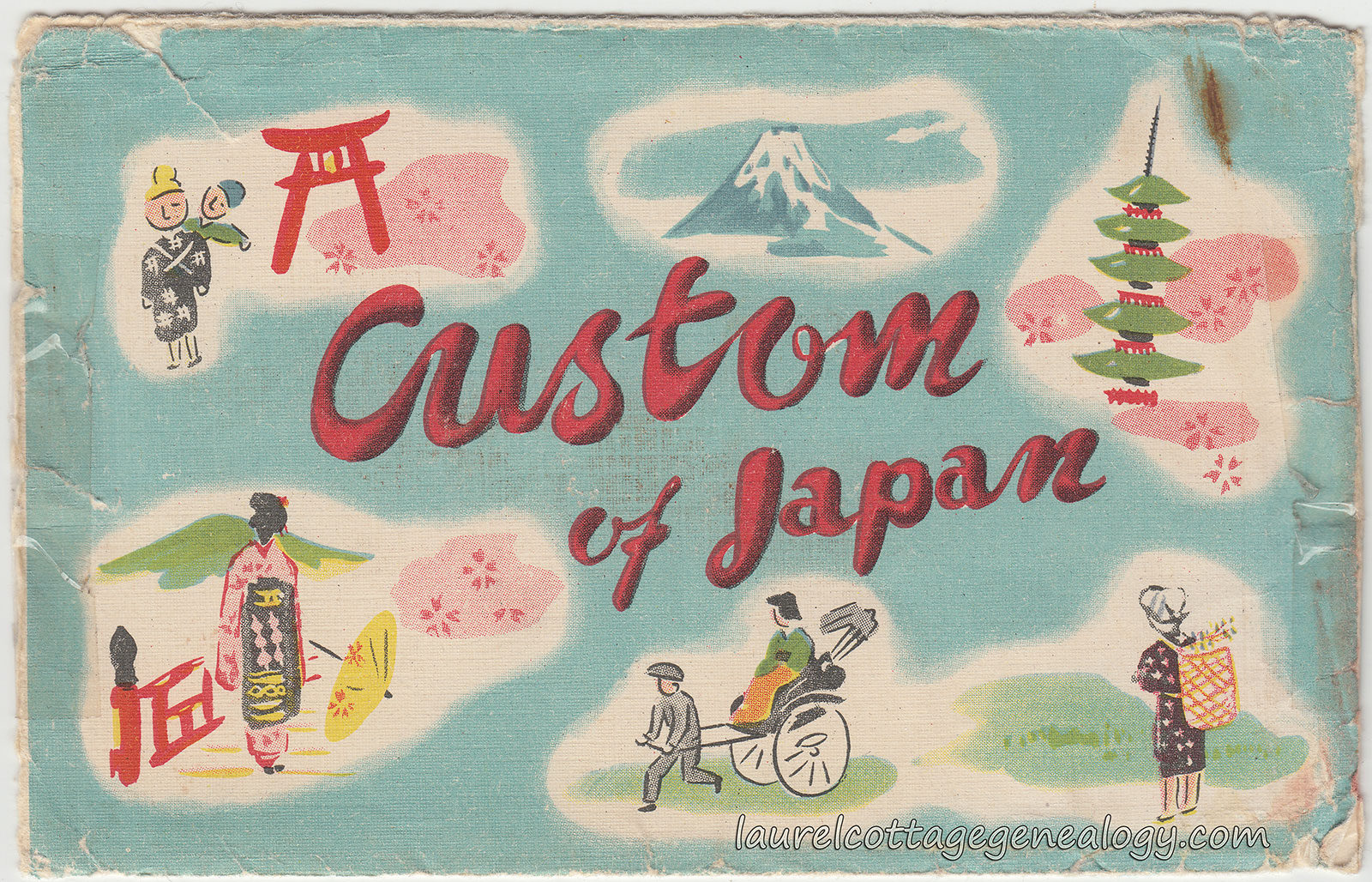
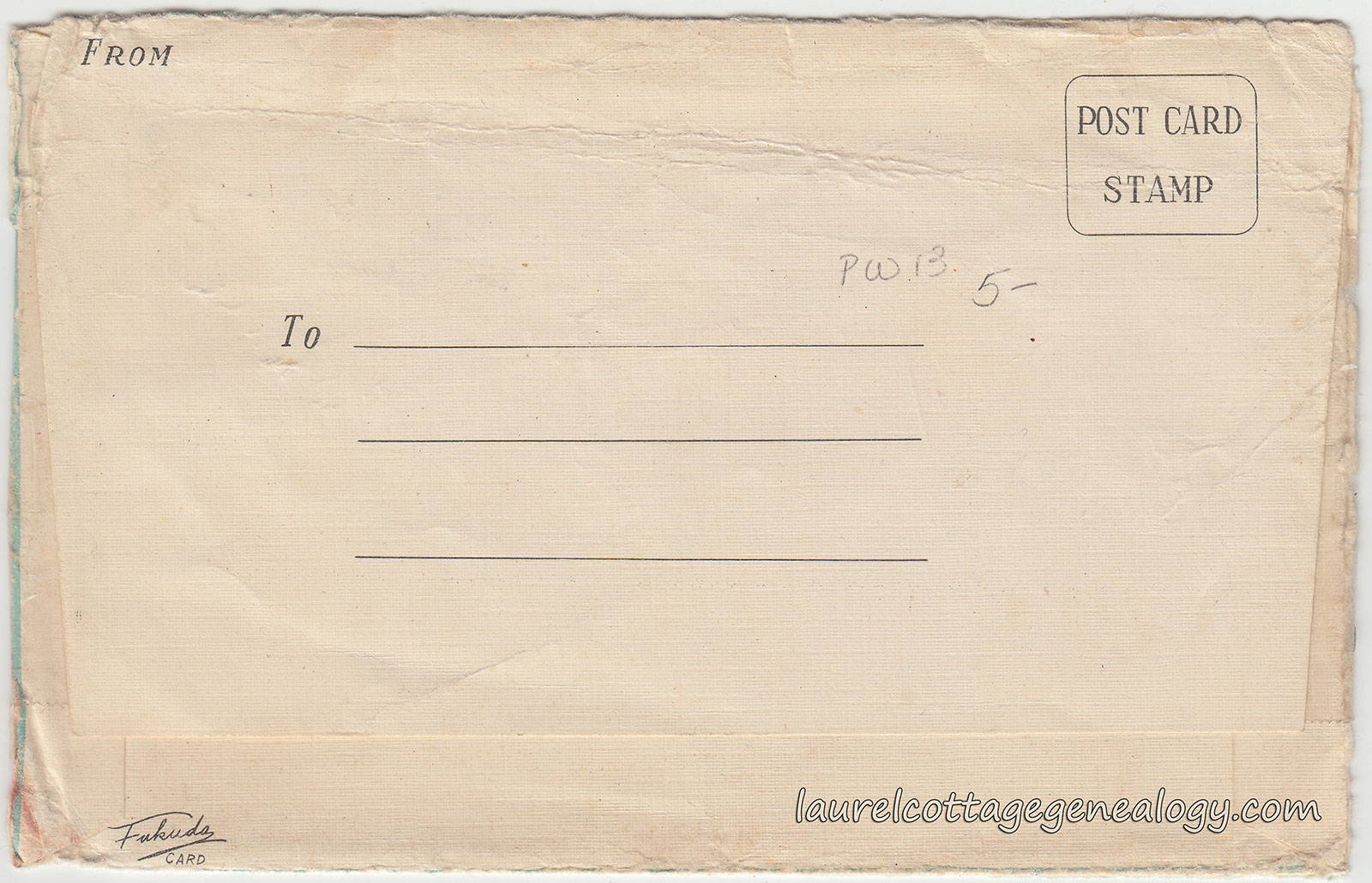
We like to do mini-themes here or try to segue from one topic or place to another, so here is a vintage tourist postcard set cover from the Fukada Card Company. It’s not in good shape but I just picked it up for the color and design. It had only one postcard in it, of a church in Seoul, Korea, (see next post) which one assumes would not have been in the original set.

Vintage postcard set cover from the Fukada Card Co. Circa 1950s – 1960s.

Price:  $1.00

Hattori Clock Tower, Tokyo 1940s

Waco Department Store Tokyo 1940s p1

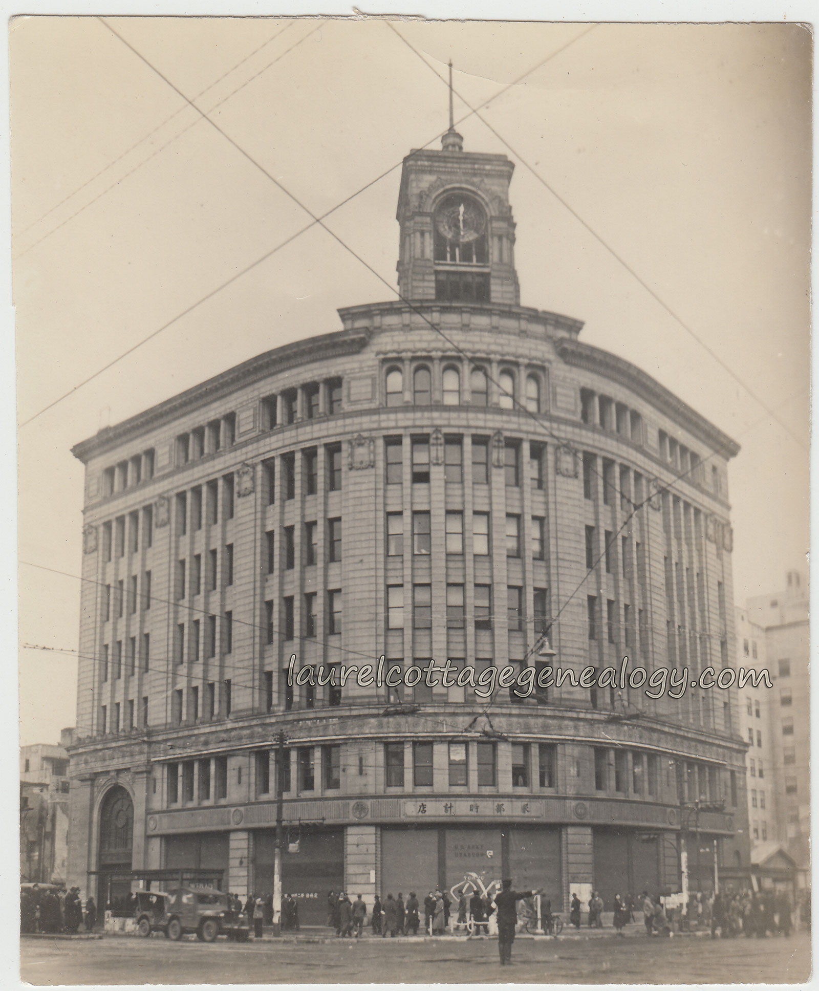
This is an old photo of what is now commonly called the Ginza Wako Building in Tokyo, Japan. It would have been taken during the Allied Occupation, which was from 1945 to 1952; during this time, the building served as the Toyko PX store. If you enlarge the image, and look on the lower center facade, just above the pedestrians, you can see that it shows  “U.S. Army”  and something underneath starting with  “U.S.A.”  but the rest is difficult to make out. We also see two army jeeps on the left.

The beautiful Neo-Renaissance structure, with it’s curved granite facade, was designed by Jin Watanabe, and completed in 1932. It is one of the few buildings in the Ginza District that survived the bombings of WWII. This photo is wonderful also for another reason:  If you glance at the building in the background, on our right, there is a very interesting optical illusion happening. Check it out!

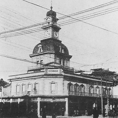
The predecessor to the above building was the Hattori Clock Tower a.k.a. the K. Hattori Building, another beauty, but of vastly different style, as one would presume from it’s time frame of construction. It was a jewelry and watch store owned by Kintaro Hattori, and stood from 1894 to 1921. This tower contained a manually operated bell while the modern day building’s clock tower plays the Westminster Chimes.

K Hattori Building in the Meiji Era

K. Hattori Building in the Meiji Era which stood from 1894 – 1921. (photo from Wikipedia)

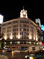
In 1921 the Hattori Clock Tower building was demolished to build a new one, but reconstruction was delayed due to the Great Kanto Earthquake, which occurred on September 1, 1923. Kintaro Hattori produced the first watches in Japan under the name of Seikosha, which later became the well-known Seiko. Below is a modern day nighttime photo (from Wikipedia.)

Waco Ginza

The Ginza Wako, owned by Wako Co., Ltd., a subsidiary of Seiko Holdings Corporation; located in the Ginza shopping district; a luxury department store whose offerings include watches, jewelry, chocolate, porcelain, dishware, handbags, upscale foreign goods, and whose sixth floor contains an art gallery.

Old photo, circa 1945 – 1952.    Size:  About 3 and 3/4 x 4 and 3/8″

Price:  $30.00

Sources:  Wako (retailer). n.d. http://en.wikipedia.org/wiki/Wako_%28retailer%29. (Accessed February 19, 2015).

File: K Hattori Building in Meiji era.JPG. n.d. http://commons.wikimedia.org/wiki/File:K_Hattori_building_in_Meiji_era.JPG. (Accessed February 20, 2015).

Muza-chan. “Sightseeing Tokyo – Wako Department Store.” Muza-chan’s Gate to Japan, January 19, 2010. Web accessed February 20, 2015.

Vera Mildred Mills

Vera Mildred Mills pc1Vera Mildred Mills pc2

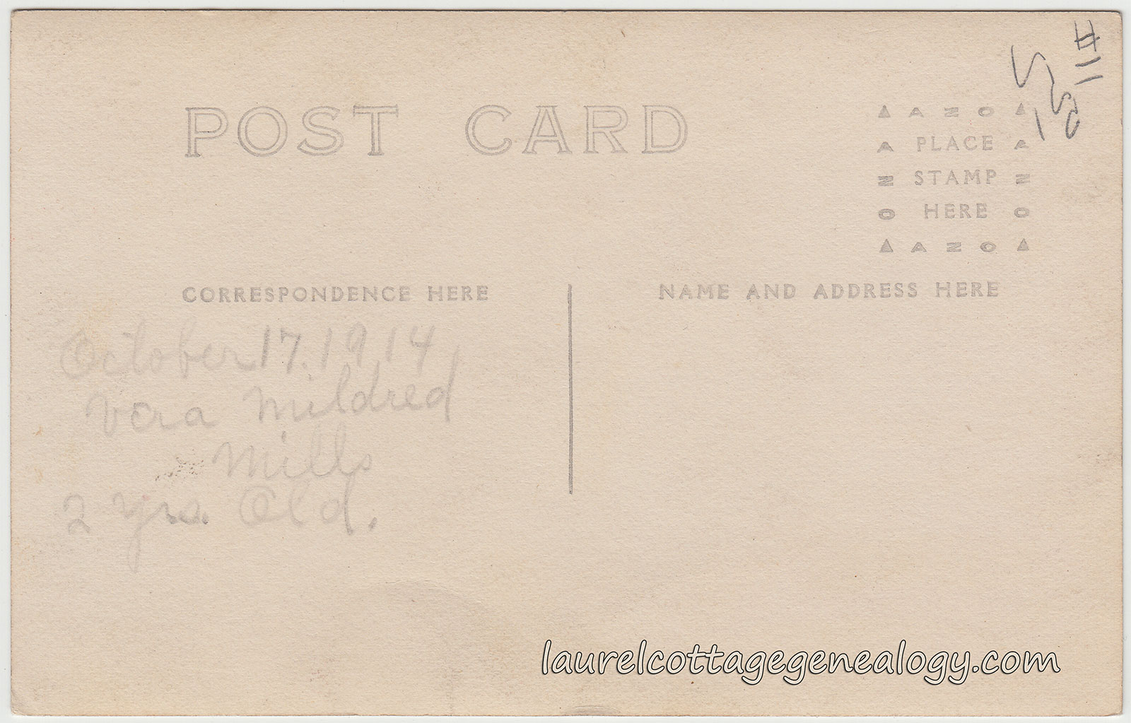
Divided back, unused with writing, Real Photo Postcard. Date:  October 17, 1914. AZO stamp box.

Price:  $15.00

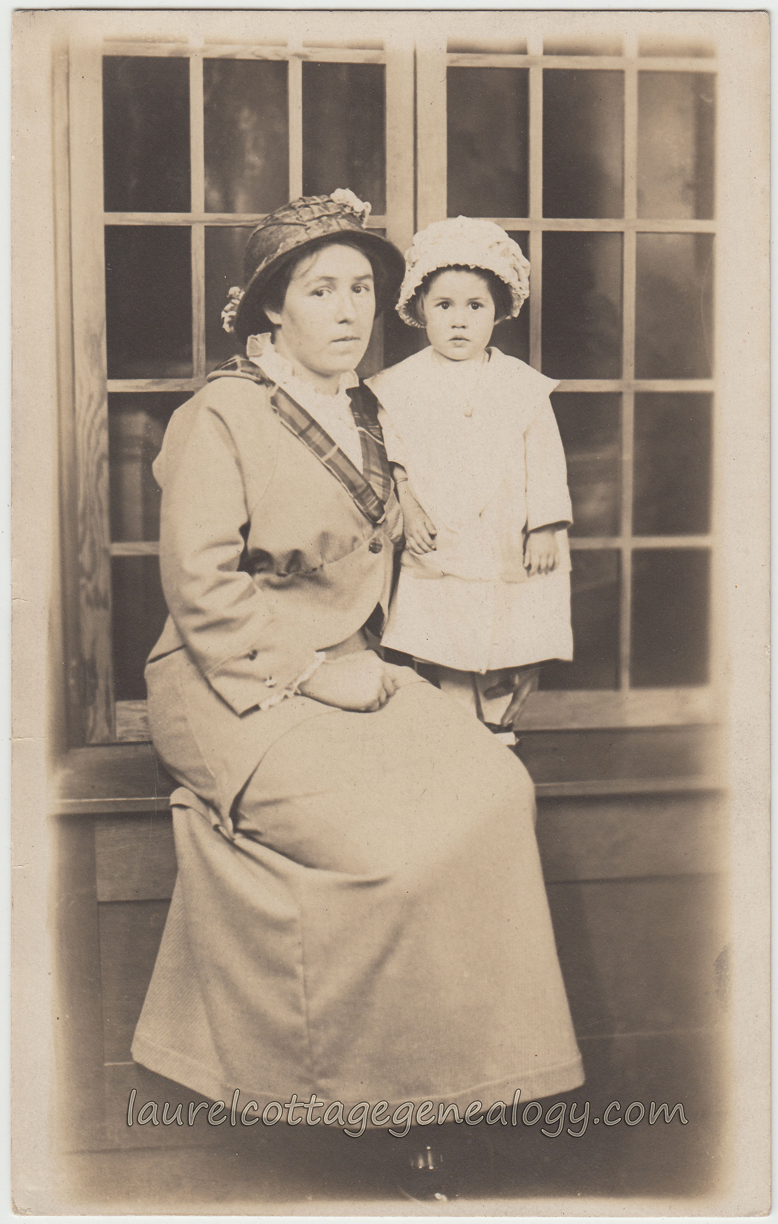
The photo for this Real Photo Postcard was taken on Vera’s birthday, October 17th. As the back of the postcard states she is two years old here. And this would appear to be her momma with her, due to the strong resemblance. The 1920 Federal Census for Compton Township, Los Angeles County, California shows Vera, age seven, born in California; her parents Samuel C. Mills, an iron worker, born in Kansas, about 1881 and Frances R. Mills, born in Utah, about 1893; and Vera’s brothers, Clifford C., age 3 and 4/12, and Victor L., not yet one month old. (This census was taken January 12th.) Both the boys were also born in California. The parents owned the residence on Euclid Avenue. By 1930, there was another addition to the family, Jack A. Mills, born in California, about 1927.

Vera married Robert James McCarty on September 2, 1932. The marriage record (which lists Vera as Mildred Vera Mills) gives her mother’s name as Ruth F. Heninger. Robert McCarty, native to Illinois is age 22, and his parents are Benjamin E. McCarty and Mabel A. Voigt. The marriage took place in Los Angeles. The death record for Vera (April 26, 1990) does also list her as Mildred V. so it seems she preferred Mildred as her first name. This was not uncommon for the first and middle names to get switched around at some point. And Vera’s mother may have done the same, since she’s on the 1920 as Frances R. Mills.

Anyway, this is a beautiful photo, I think we’re safe to say of mother and daughter, both of course in hats (!) for the occasion of Vera’s second birthday. It’s an indoor photo, as you can see, with Frances seated at a window seat, holding Vera who stands just next to her. I like Frances’ plaid trimmed jacket.

Sources:  Date: 1990-04-26. Ancestry.com. U.S., Social Security Death Index, 1935-2014.

Year: 1920; Census Place: Compton, Los Angeles, California; Roll: T625_103; Page: 11A; Enumeration District: 40; Image: 81. (Ancestry.com)

Year: 1930; Census Place: Compton, Los Angeles, California; Roll: 125; Page: 10A; Enumeration District: 0878; Image: 831.0; FHL microfilm: 2339860. (Ancestry.com)

“California, County Marriages, 1850-1952,” index and images, FamilySearch (https://familysearch.org/pal:/MM9.1.1/K8JH-9SB : accessed 17 February 2015), Robert James Mc Carty and Mildred Vera Mills, 02 Sep 1932; citing Los Angeles, California, United States, county courthouses, California; FHL microfilm 2,074,990.

Four Little Angels

Four Little Angels pc1Four Little Angels pc2

Divided back, unused Real Photo Postcard. Cyko stamp box. December 1912.

Price:  $15.00

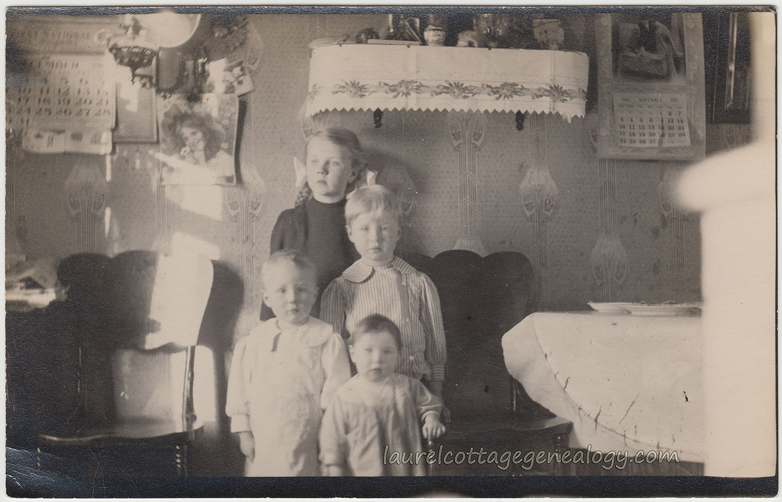
This one is from December 1912, showing four siblings, ages maybe about 18 months to six years old. The eldest is a girl, the middle two are boys and the youngest, I believe, is a boy, as well. They can’t be any cuter with those angelic faces! They’re posed in their kitchen or dining room. We see a table draped with a white cloth and a couple of dishes set up there, and two beautiful dark wood chairs, not too ornate but with sort of an unusual scalloped top. The wallpaper is lovely, and there’s a small curio shelf covered with what looks like a linen cloth with a flowered, lace edged border, and various knick knacks. The sun is shining in the room, and the three youngest are looking at the camera while the girl gazes off into the distance. Thankfully, there are wall calendars hanging up, and the month and year are readable. Upon close scrutiny, we see that the one on our left indicates December, and the one on our right shows November, and what looks like 1912. It is 1912, but ahaaa! November’s page is halfway torn off to reveal December’s dates matching with the calendar on the left. Also, of much interest, is the print of the pretty dark-haired girl in bonnet, tacked up on the wall. Just the kind of thing we are now looking at as “antique ephemera” so for me, I get this stepping back in time, or the “veil” between time frames is very thin, kind of feeling – more so than normal. Love it!

How About This One?

How About This One pc1How About This One pc2

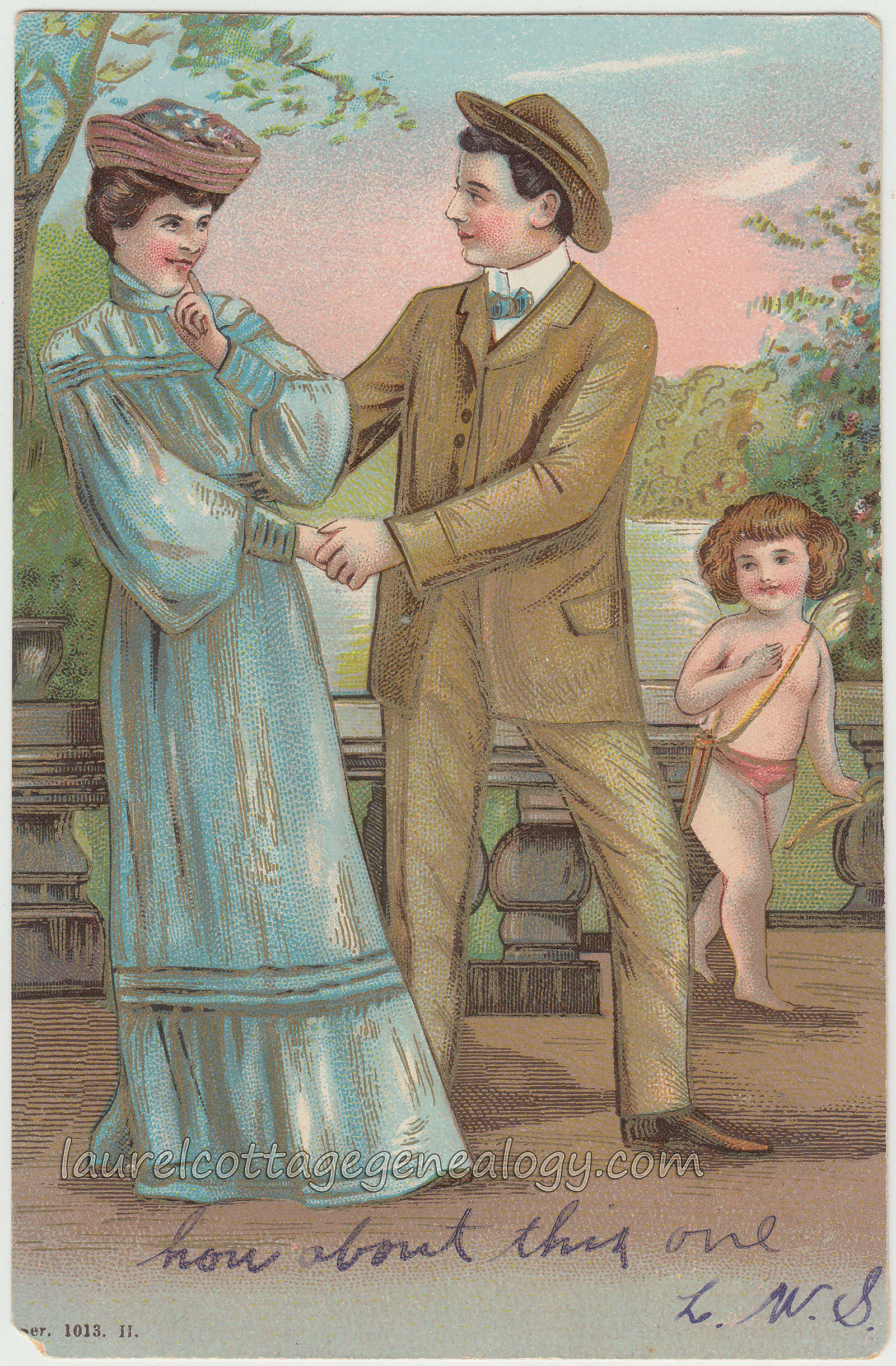
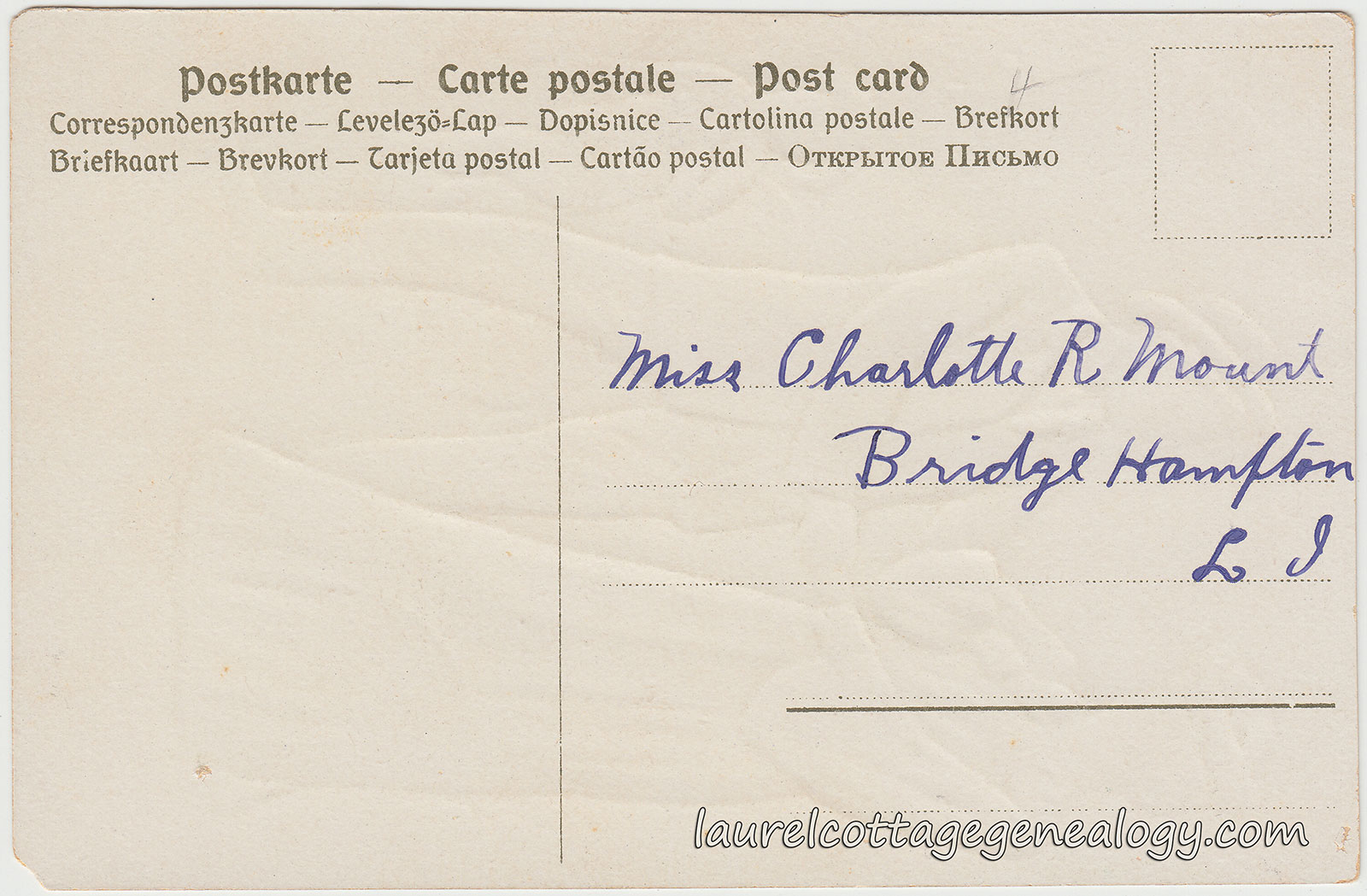
The addressee, Charlotte R. Mount, was found on the 1910 Federal Census for Southampton, Long Island, New York. Bridgehampton is located in the town of Southampton. (Ahhh, The Hamptons – never got that till just now, duhh!) But, this is a cute card with nice colors and gold-tone highlighting, showing a gentleman trying to persuade a lady to come along with him. She’s smiling back at him while a pleased cupid looks on from the background. The sender wrote an appropriate and funny caption,  “how about this one”  and signed their initials,  “L.W.S.”

The 1910 census shows:  Theodore H. Mount, born about 1838 in South Carolina, working as a farmer; his wife Catherine L., born about 1845 in New York, working from home as a laundress; and their grown children T. Herbert Mount, born about 1866 in New York, doing day labor; and Charlotte R. Mount, born about 1887 in New York, no occupation listed.

Divided back, unused with writing, embossed postcard. Publisher unknown. Series or number 1013.

$10.00

Source:  Year: 1910; Census Place: Southampton, Suffolk, New York; Roll: T624_1082; Page: 6B; Enumeration District: 1390; FHL microfilm: 1375095. (Ancestry.com)

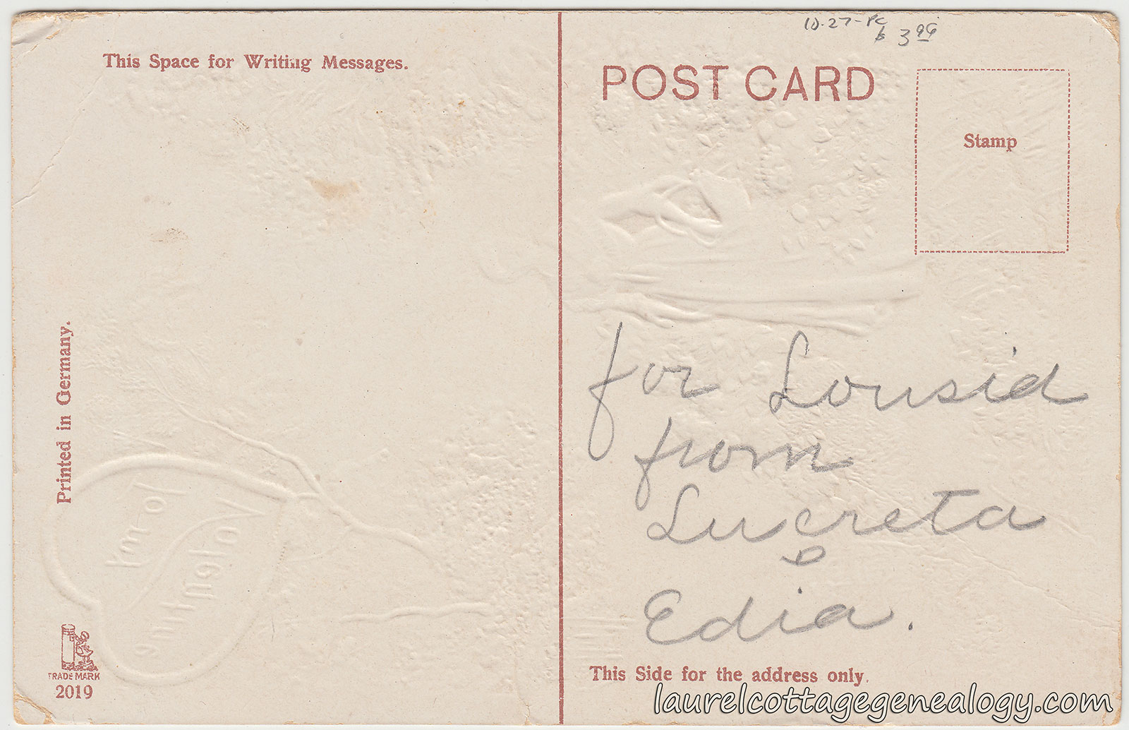
For Lousia From Lucreta And Edia

For Lousia From Lucreta And Edia pc1For Lousia From Lucreta And Edia pc2

It’s funny that this postcard with the trademark below, comes right after the prior post. Same theme – a child standing on a flat-surfaced rock reaching to put a postcard in the mailbox. Different mailbox style, and this one shows a little girl, and she is facing the opposite way as the little boy, but still!

Gottschalk tm  Gottschalk, Dreyfuss & Davis publisher trademark.

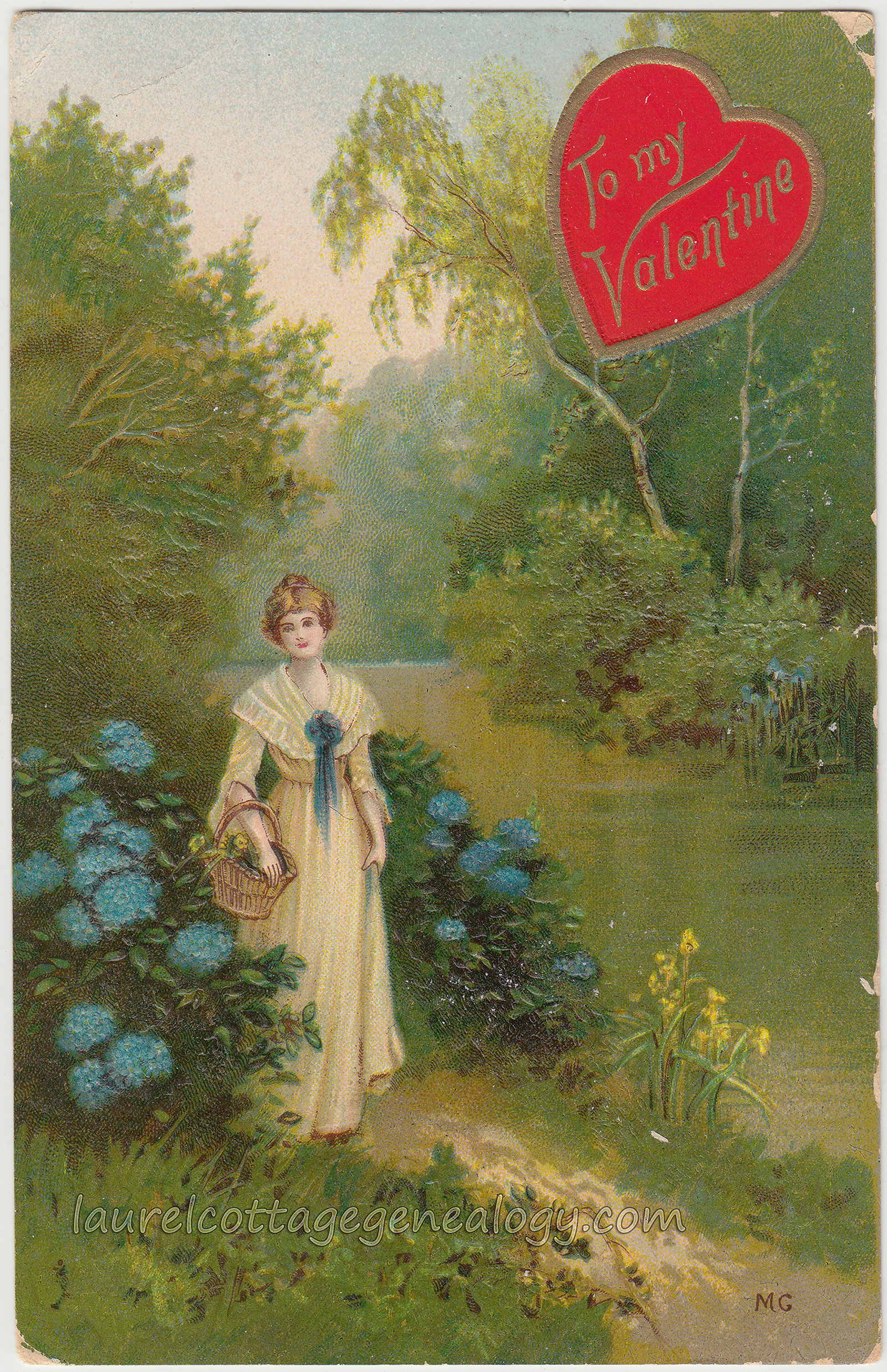
This card was found in Salinas, California, so it’s possible that the Lousia, Lucreta and Edia were from this area (but I didn’t see any matches from a quick online search.) At first glance, I must admit, I thought the names were misspelled, as in written hastily and wouldn’t it be Louisa and Lucretia?, but no, there are plenty of entries under these spellings. The postcard appears to be an artist-signed work, with initials  “M.G.”  and shows a countryside scene of a graceful young woman, holding a basket, standing in front of some blue hydrangeas, on a little path next to a river that is reflecting green and gold. A red heart bearing the inscription  “To my Valentine”  appears at the top right. A very similarly styled valentine postcard by this publisher, dated 1909, shows up online right now (on Vintagepostals.com) but for me, the artist’s name remains a mystery. I don’t see anything specific to tie these initials in with Manni Grosze, who is known for his silhouettes and whose full signature appears on his work or for another with initals MG (also silhouettes) attributed to Marte Graf.

Divided back, embossed, unused with writing. Artist signed with initials M.G. Publisher:  Gottschalk, Dreyfuss & Davis. Number or series 2019. Printed in Germany. Circa 1909.

Price:  $8.00

All A-Tiptoe

All Atiptoe pc1All Atiptoe pc2

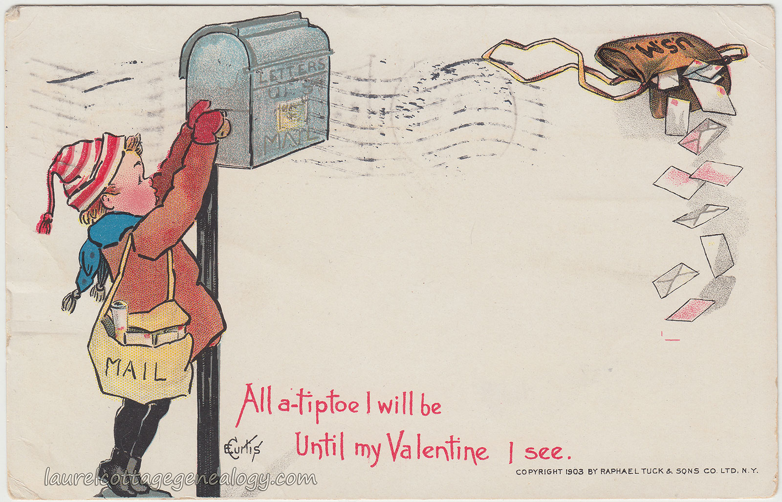
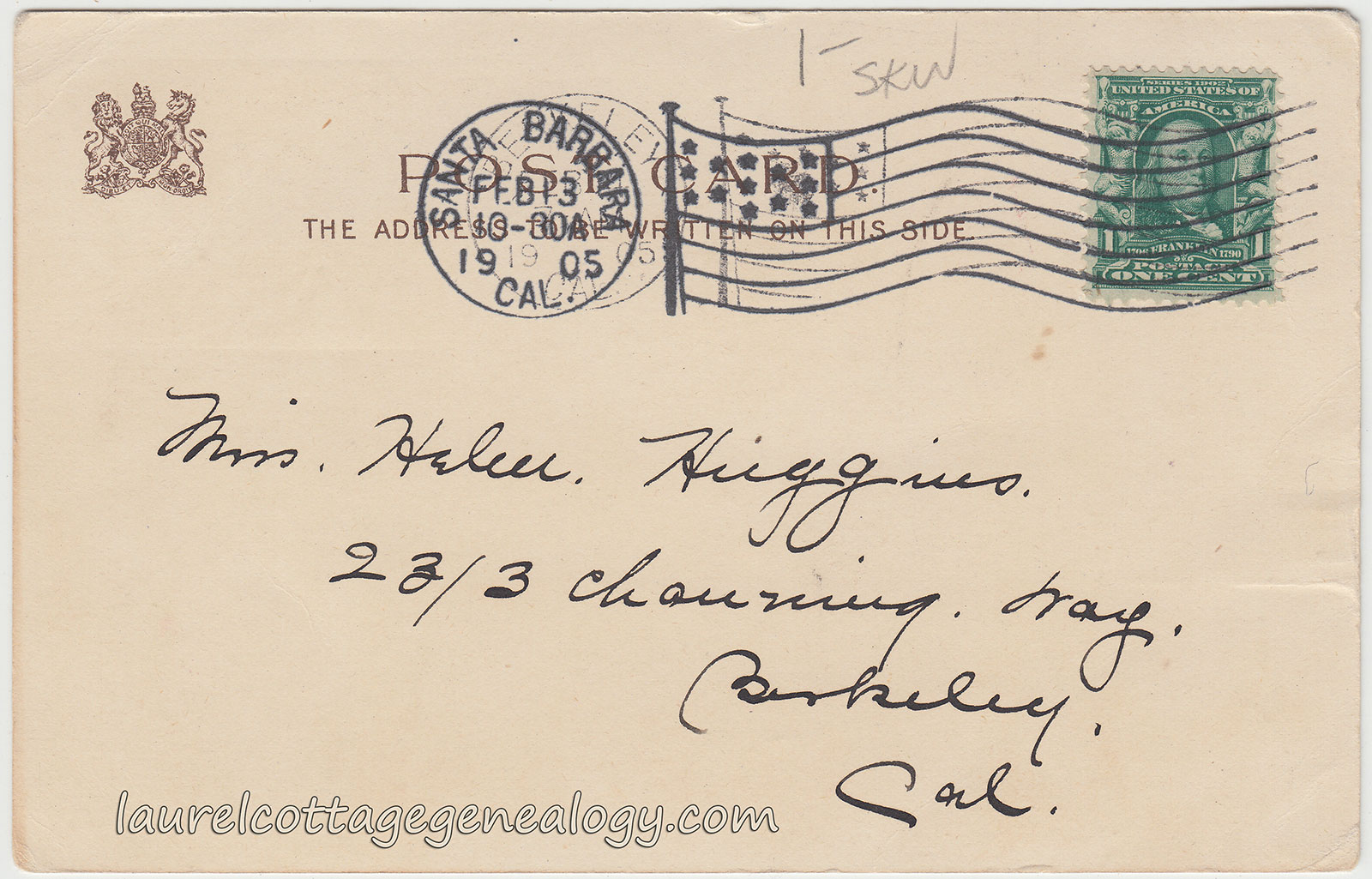
Undivided back, artist-signed, used postcard. Postmarked February 13, 1905 from Santa Barbara, California. Artist:  Elizabeth Curtis. Publisher:  Raphael Tuck & Sons Co., Ltd., New York. Copyright 1903.

Price:  $15.00

“All a-tiptoe I will be

Until my Valentine I see.”

Here’s a beautiful E. Curtis, (Elizabeth Curtis) artist-signed postcard published by Raphael Tuck & Sons. The artwork is actually a little cut off at the bottom, but it shows a little boy in red-striped winter hat and blue scarf, with a mailbag on his shoulder, on tip-toe reaching to the mailbox. The composition is lovely with another mailbag illustrated at the top right, open and with letters falling. The card is addressed to:

“Miss Helen Huggins, 2313 Channing Way, Berkeley, Cal.”

Helen Huggins would have been about five or six years old when she received this postcard. She can be found on the 1920 Federal Census for Berkeley, at the address on the postcard, born in California, about 1899. She is with her parents, Charles W. Huggins, born Minnesota, about 1861, working as a civil engineer for the city, and Pearl O. Huggins, born Missouri, about 1871; and younger sister, Bernice Huggins, born California, about 1903. Boarding with the family is Euphemia A. Black, born California, about 1881, occupation Housekeeper.

Source:  Year: 1920; Census Place: Berkeley, Alameda, California; Roll: T625_93; Page: 6A; Enumeration District: 184; Image: 113. (Ancestry.com.)